
1. Setting the Stage: The Psychology of Color in Interior Design
Understanding Color Theory: How Colors Influence Emotion and Space
Color theory is a crucial element in interior design, particularly when it comes to selecting countertops. Understanding how different colors affect human psychology is invaluable to crafting a harmonious living environment. Colors can evoke emotions, set moods, and significantly alter perceptions of space. For example, warm colors like reds, oranges, and yellows tend to create a cozy, inviting atmosphere, making them ideal for kitchens where homey interactions occur. On the other hand, cool colors such as blues and greens are often associated with calmness and tranquility, making them suitable for bathrooms or spaces designed for relaxation.
Moreover, the use of color can visually manipulate space. Light colors tend to reflect more light, making a small kitchen appear larger and more open. Darker hues, while dramatic and rich, can cause a room to feel more enclosed if not used thoughtfully. The balance comes in understanding your space’s unique dynamics and how your chosen color influences both visual perception and emotional experience. So, before you commit to a particular hue, consider not just how it looks but how it feels—this empathetic approach is the heart of successful interior design.
Neutrals vs. Bold Colors: Finding Balance in Your Kitchen or Bathroom
When considering countertop colour options, a classic debate emerges: neutrals versus bold colors. Neutrals, including shades like beige, white, gray, and taupe, offer versatility and timelessness. They provide the perfect backdrop, ensuring that other design elements like cabinetry and flooring can shine without competing for attention. Neutrals evoke a sense of calm and provide a canvas into which you can infuse various textures and patterns, making them a safe yet stylish choice.
However, bold colors provide an opportunity for customization and personal expression. Deep reds, vibrant blues, or rich greens can make a striking statement, transforming an ordinary space into an extraordinary one. The key to success lies in balance; integrating bold colors should never overshadow the entire space. Instead, they should complement your overall design vision while allowing the subtleties of textures and finishes to enhance rather than distract. A dynamic approach could involve choosing bold countertops while surrounding them with neutral cabinetry, striking a harmonious balance that emphasizes both elements effectively.
2. Classic Choices: Timeless Countertop Colors That Never Go Out of Style
Elegant Whites and Grays: The Sophistication of Marble and Quartz
Whites and grays have long been favored in countertops for their sophistication and versatility. Elegant white countertops, particularly marble variants, bring an air of luxury and timelessness. Marble is revered for its unique veining patterns and natural beauty, making each slab a piece of art in its own right. Additionally, quartz countertops, engineered from natural quartz crystals, offer similar aesthetics with the added benefit of greater durability and less maintenance. These materials are not only visually appealing but also provide an excellent return on investment, as they can elevate a kitchen or bathroom’s overall decor and appeal, making them valuable assets in a home’s resale value.
Moreover, white and gray tones seamlessly adapt to various styles—from minimalist modern to classic elegance, enhancing the aesthetic irrespective of the design language. Whether you prefer a crisp, polished finish or a matte surface, these colors can reflect natural light beautifully, contributing to an open and airy feel, especially in smaller spaces. When considering your options, think about integrating texture and layering using accessories and hardware to create depth against the pristine simplicity of white or gray countertops.
Rich Earth Tones: Embracing the Warmth of Natural Stone
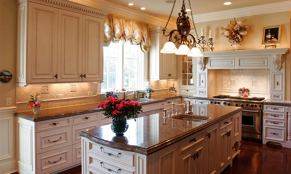
Rich earth tones, including browns, tans, and deep greens, tap into the organic beauty of the natural world. Countertops made of granite, soapstone, and other natural stones not only offer stunning visual appeal through their unique textures and color variations, but they also bring warmth and a tactile quality that synthetic materials often lack. These natural stones evoke a sense of grounding and connection to nature, making them ideal for those seeking to create a cozy and inviting atmosphere within their homes.
The warmth of earthy tones pairs wonderfully with wooden cabinetry and other natural materials, resulting in an organic yet sophisticated look. Furthermore, these colors are available in varying finishes—from honed to polished—allowing for customization according to the desired level of sheen and maintenance. Earthy tones also have an incredible ability to mask stains and wear, making them practical choices for high-traffic areas. By embracing the rich diversity of earth tones in your countertop selection, you can foster an environment that feels both homey and refined.
3. Trendy Palettes: Contemporary Colors for the Modern Home
Deep Blues and Greens: Infusing Serenity and Sophistication
Contemporary design often leverages deep blue and green tones to create a serene yet sophisticated environment. These colors evoke a connection to nature and tranquility, promoting relaxation in spaces where we unwind. In kitchens and bathrooms, deep blues can act as a bold statement, offering a modern twist that resonates well with current design trends. Paired with light cabinets or brass fixtures, deep blue countertops possess an understated elegance that speaks volumes about personal style and class.
On the other hand, deep greens interject richness and a lush feeling, reminiscent of serene landscapes. Incorporating these colors into countertops can be incredibly refreshing, especially when balanced with organic textures and natural wood tones. Opting for these shades can also enhance the overall color palette of your home and introduce a sense of harmony and continuity throughout the interiors. Remember, the key to using these deeper tones is ensuring that ample lighting is present, mitigating any feelings of confinement and ensuring that the beauty of the colors is showcased effectively.
Metallic and Textured Finishes: Adding Depth to Your Countertops
The rise of metallic finishes in interior design reflects a growing trend toward unique textures and visual interest. Metallic and textured countertop finishes allow homeowners to make bold statements while also infusing depth and dimension into the decor. Materials such as brushed brass or stainless steel countertops bring a modern, industrial flair that distinguishes a space with unique character. These surfaces can also be remarkably practical, as they are often resistant to heat and stains, making them highly functional for busy kitchens or contemporary dining areas.
Consider combining these materials with solid color cabinets or vibrant backsplash tiles for a dynamic contrast that draws the eye and elevates the overall aesthetic. Textured finishes—whether they are subtly speckled or feature prominent striations—can also provide a tactile sensation that invites touch and engagement. Integrating metallic elements isn’t just about aesthetics; they can also reflect light beautifully, enhancing the ambiance and creating a warm, inviting atmosphere. As you explore contemporary options, think creatively about how to pair these finishes with different colors and materials, ensuring that your choice resonates with your personal style while maximizing functionality.
4. Personalizing Your Space: Selecting the Perfect Color for Your Unique Style
Behind the Trend: How Personal Story and Lifestyle Shape Your Choices
Choosing a countertop color is not merely a matter of trends or palettes; it is a reflection of personal story and lifestyle. Your home environment should resonate with who you are, showcasing your experiences, preferences, and values. For many homeowners, their space represents cherished memories, family gatherings, and unique celebrations. That’s why it’s vital to select colors that hold personal significance or reflect your design philosophy. For example, if you have fond memories of cooking in a bright kitchen, a sunny yellow or a vibrant orange may act as motivators, infusing energy into everyday tasks.
Understanding your daily routines assesses how your space functions and influences your choices. For those who love entertaining, edgier color palettes that create energy may take precedence. Alternatively, if you prioritize serene, quiet evenings, muted tones and calming shades may serve you better. In every case, the choice of counter colors should align with your individual lifestyle needs, enhancing the functionality of your space while also encapsulating your unique personality.
Mixing and Matching: Harmonizing Countertops with Cabinets and Backsplashes
Mixing and matching colors can be a daunting task, yet it also presents a fantastic opportunity to express creativity. Harmonizing countertops with cabinets and backsplashes opens up a world of combinations that can dramatically alter the feel of any space. One effective strategy is to create contrast; pairing a dark countertop with light cabinetry or vice versa can yield a striking visual effect that enhances both elements. This contrast creates balance and flow, drawing attention to key design features while ensuring that the overall look remains cohesive.
Meanwhile, when selecting backsplashes, consider using either complementary hues that echo the colors in the countertops or patterns that introduce a layer of texture. For instance, if you settle on a matte black countertop, elegant white cabinetry paired with a textural tile backsplash could create a stunning, modern look. Alternatively, a vibrant glass tile might uplift the entire concept when juxtaposed with solid stone surfaces. Ultimately, successful mixing and matching depend largely on understanding trends while honoring personal preference—by striking this balance, you can create a harmonious design that speaks to your individuality.
FAQ
Question: How do I choose a countertop color that suits my home’s overall design? – To choose a countertop color that suits your home’s design, consider the existing colors and materials in your space, such as cabinets and flooring. Aim for a harmonious look by selecting hues that complement or contrast effectively without clashing.
Question: What are the best countertop materials for high-traffic areas? – The best countertop materials for high-traffic areas are those that offer durability and resistance to stains and scratches. Options like granite, quartz, and concrete provide both beauty and strength, ensuring they stand up to everyday use.
Question: Can I change my countertop color after installation? – While it is possible to change your countertop color after installation, it typically involves significant work, such as replacing the entire surface or applying a new finish. It’s essential to consider your long-term design vision before making a commitment.
Question: How do I maintain my countertops to keep their color vibrant? – To maintain your countertops and keep their color vibrant, regularly clean them with gentle, non-abrasive cleaners, avoid harsh chemicals, and use trivets to prevent heat damage. Follow the care instructions specific to the material for best results.
Question: What colors work best in smaller spaces? – In smaller spaces, light or soft colors work best as they reflect more light and create an illusion of openness. Whites, light grays, and pastels can make a small kitchen or bathroom feel larger and more inviting.
Question: How can I incorporate bold colors without overwhelming the space? – To incorporate bold colors without overwhelming a space, consider using them as accents, such as in countertops, paired with neutral surroundings. This approach allows for impactful statements while maintaining a balanced atmosphere.
Question: Are there environmentally friendly options for countertops? – Yes, there are environmentally friendly options for countertops, such as recycled materials, reclaimed wood, and sustainable stones. These choices minimize environmental impact while providing unique aesthetics for your kitchen or bath.
Question: How does lighting affect the perception of countertop colors? – Lighting significantly affects the perception of countertop colors, as natural and artificial light can alter how hues appear. Bright, natural light tends to showcase colors more vibrantly, while subdued lighting may mute them, so consider light sources when selecting your countertop.
Useful Resources
- Architectural Digest – Interior design trends and color theory insights.
- Houzz – Home design inspiration, ideas, and discussions on color choices.
- Color Psychology – Understanding how colors affect emotions and behavior.
- Builder Magazine – Trends in home building and design, including materials and styles.
- Interior Define – Custom furniture and design ideas including color schemes.
- Lowe’s – Home improvement resources including materials for countertops.
- DIY Network – Tips for home improvement and interior design projects.
- The Pinnacle List – Articles on luxury and high-end design topics including color elements.